
Care that
sees you.
sees you.
Text
A gentle way to enter the conversation.
Her Down There · Brand & experience
A welcoming world for women’s health. Bold display type, confident color, and warm, hand-painted healthcare illustrations.
 Care begins with connection.
Color palette
Magenta #B5006E and plum #6B1F5C come directly from the updated logo. Soft blush and cream keep the experience welcoming. Click a swatch to copy its color.
Clear contrast supports readable, approachable care. Gradients and image overlays are used sparingly.
Typography
Care that sees all of you.
Your questions matter. Your story matters. We make room for both, with care that feels personal from the very first conversation.
One illustration family
Our original illustrations, finished in warm editorial gouache. Visible brushstrokes, layered paint and paper grain bring texture to familiar subjects and blush shapes.




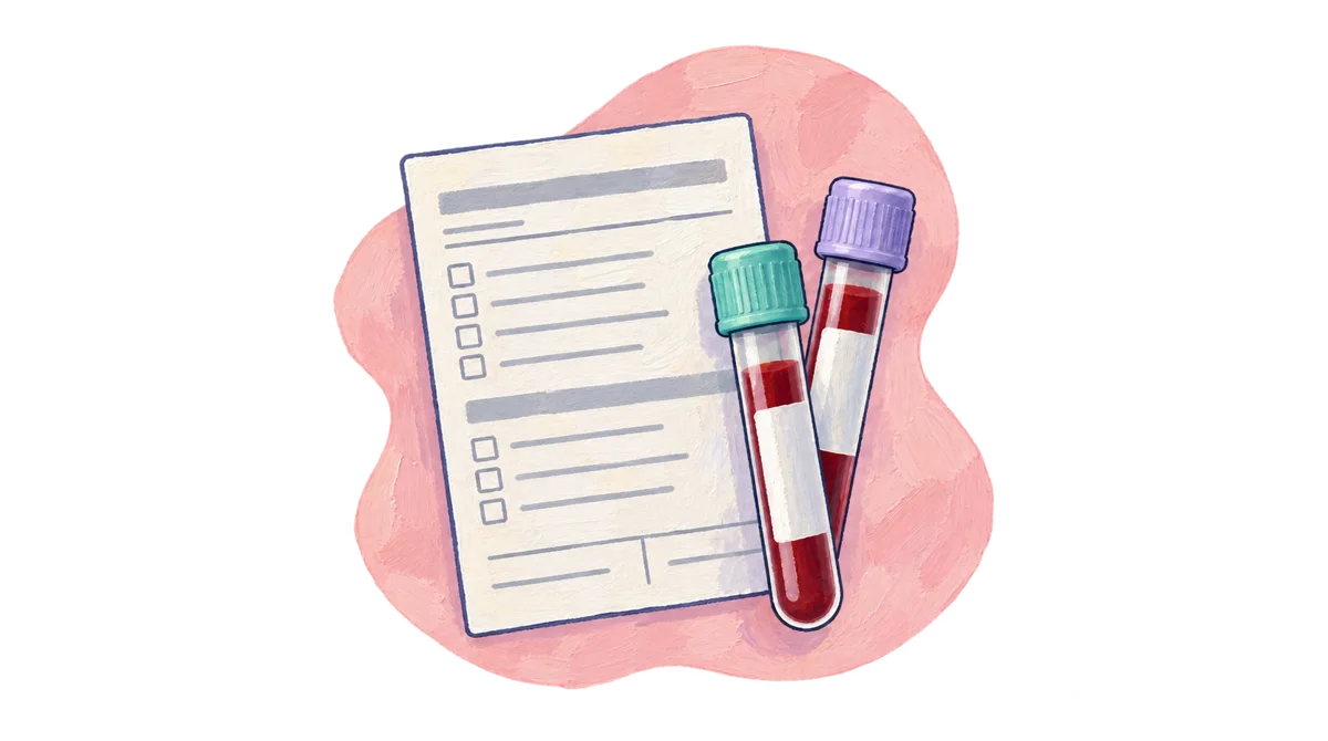
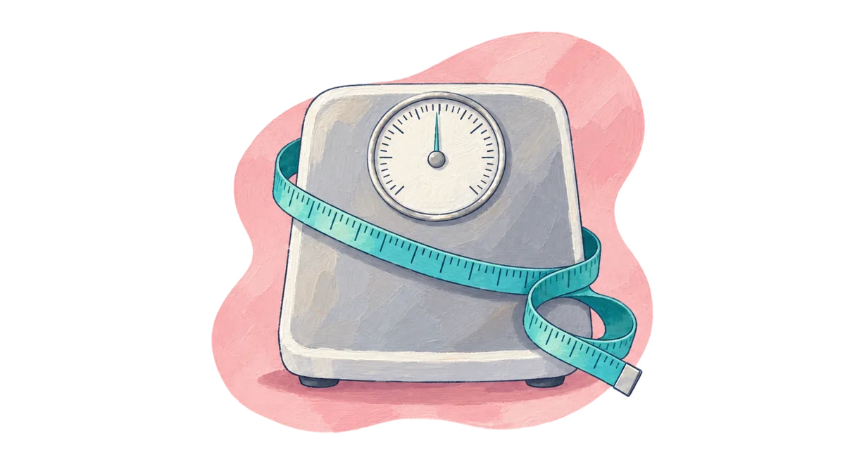
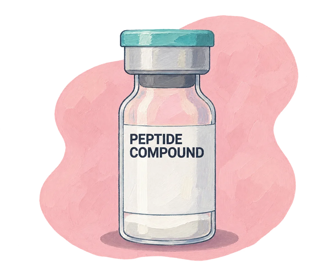
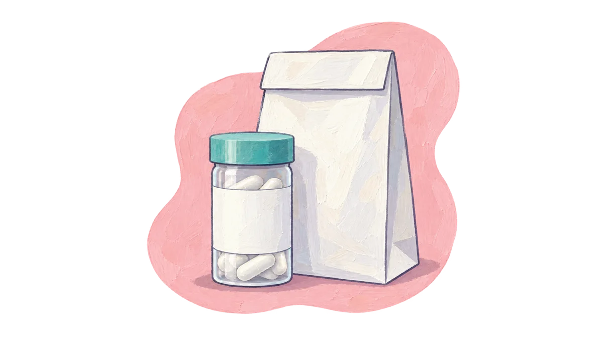
Medical objects, made approachable.
Retain the original palette, subjects and blush shapes. Add gouache texture only; no plants, foliage, greenery or invented scenery.
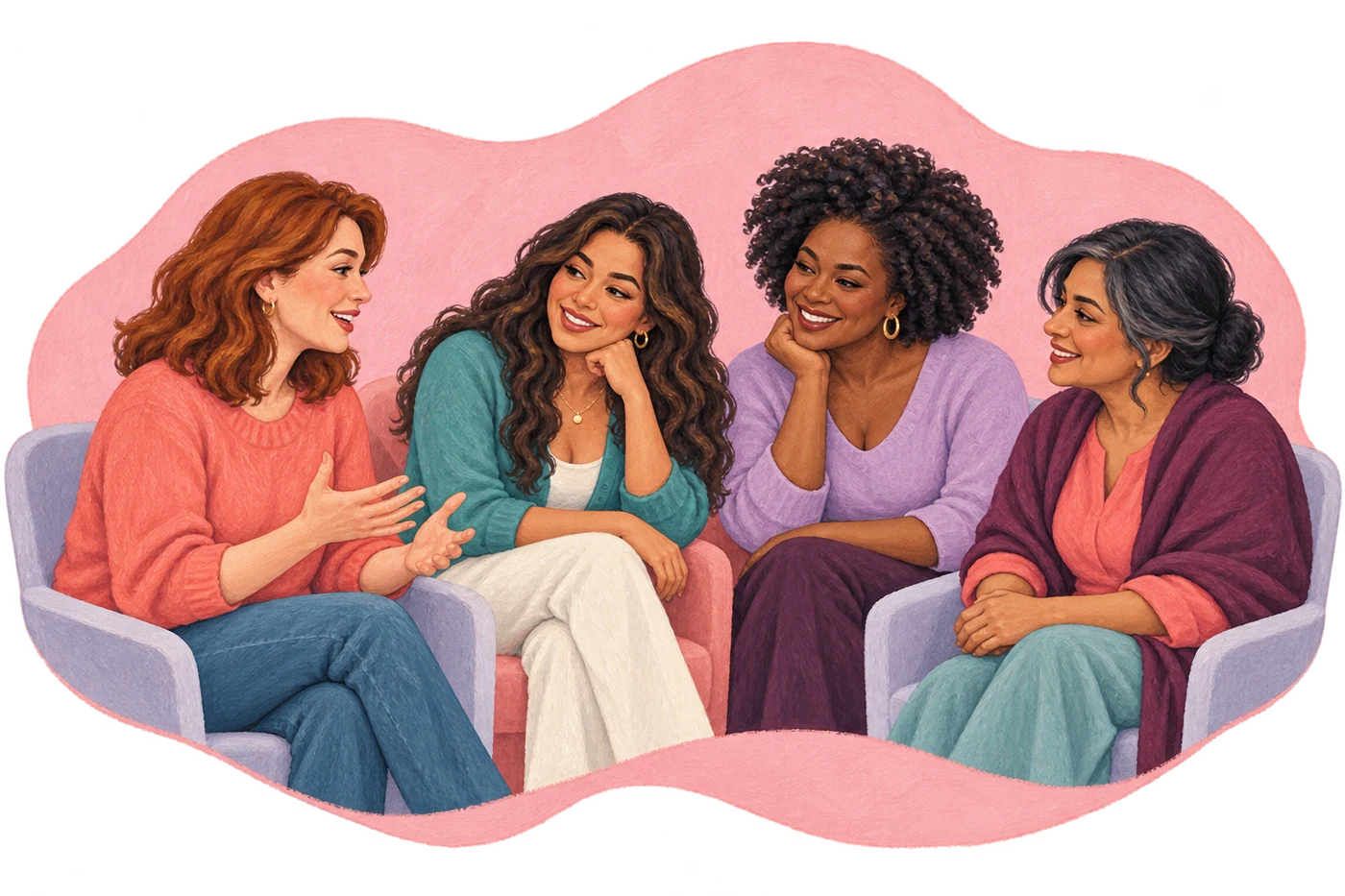
People, with warmth.
Preserve the original people, poses, medical objects and diagrams. Apply expressive paint texture without changing what each image communicates.
Space to breathe.
Keep the full subject visible. Preserve painted edges and transparent outer space; avoid sharp vector outlines and harsh shadows.
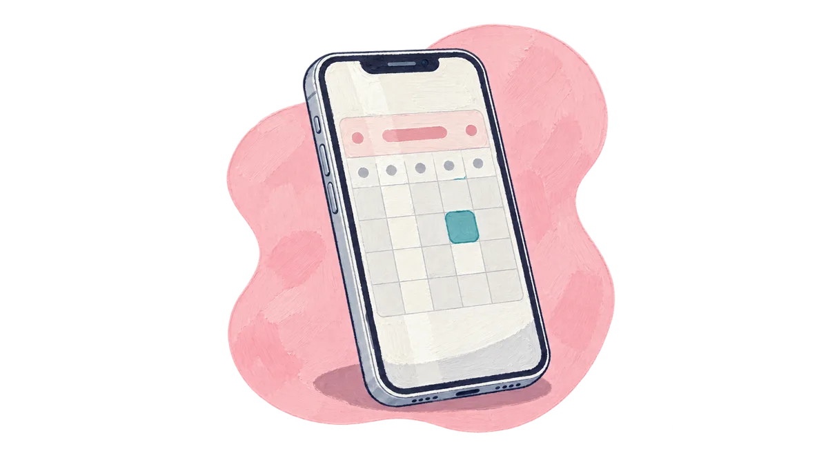


The hero collection
Purpose-made illustrations for memberships, pricing and insurance, our care, About, ongoing care, contact and patient stories. The same painted texture, familiar characters, blush shapes and transparent backgrounds.






Reusable components
Form fields
Helpful answers
Yes. Virtual visits are available for patients in Texas. Some concerns require an in-person visit.
Our team can help verify benefits before your appointment.
8 · 16 · 24 · 32 · 48 · 64 · 96
1,248px + comfortable margins
16px cards · 24px features · pill buttons
Luxury GSAP motion
A gentle way to enter the conversation.
A calm introduction to every illustration.
A small response to every intention.
A natural rhythm as the story unfolds.
Reduced-motion preferences are respected automatically. Essential content and controls remain available without animation.
Brand assets
Use the full logo where space allows, the text logo for compact placements, and the symbol for the favicon. Preserve the original proportions and colors.


Selected website motion: magnetic press for buttons and gentle scale settle for image reveals. Reduced-motion preferences remain respected.
Download design system Markdown